Onsite UK
Group
After working with the owner of Onsite UK Group on pervious projects, he invited me to work on the rebranding of Onsite UK Group.
The decision to cover more aspects of security prompted the rebrand, looking to capture more of the market share, Onsite UK Group wanted a new more professional look for the brand.
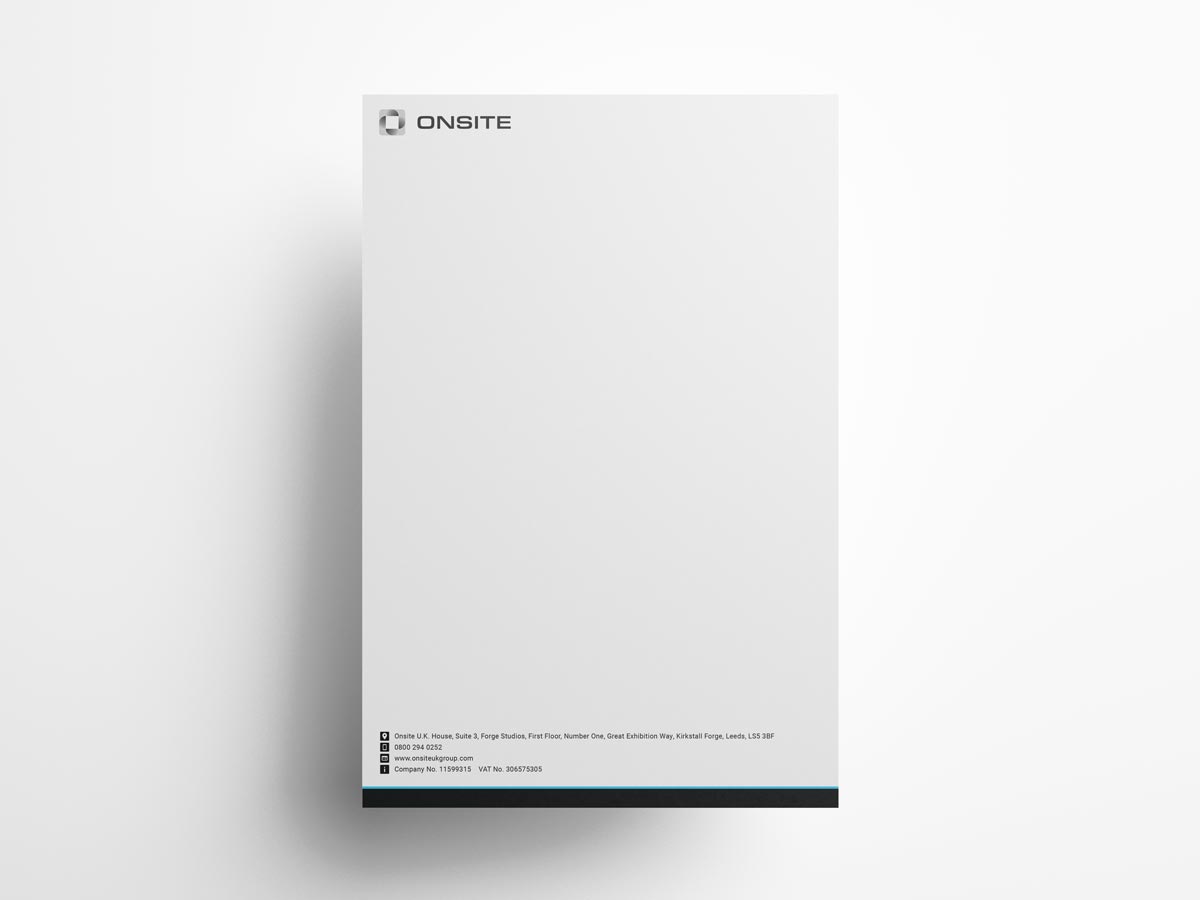
Onsite UK Group Letterhead
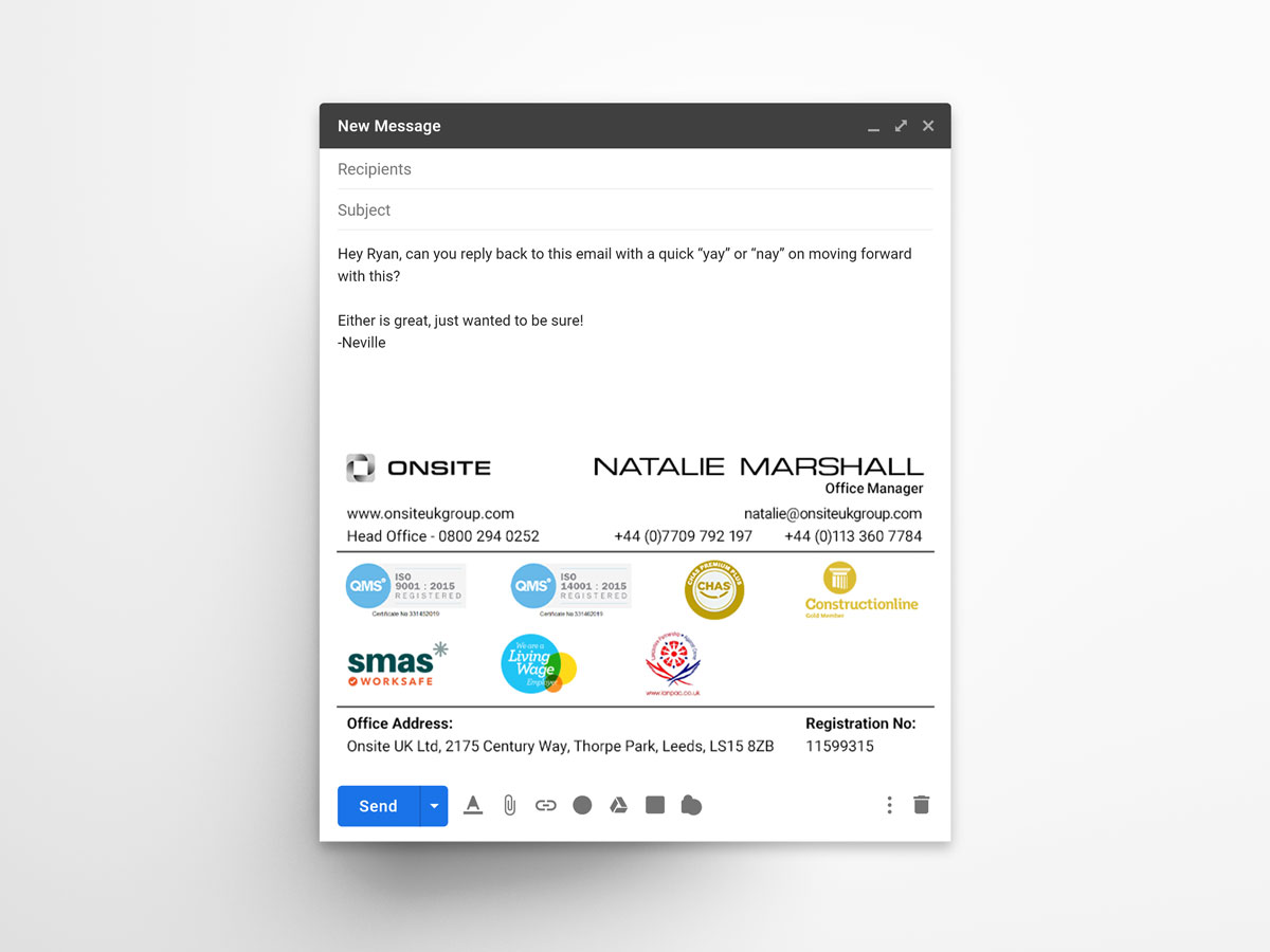
Onsite UK Group Email Signature
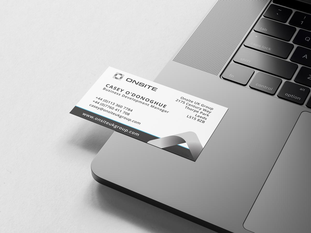
Onsite UK Group Business Card



Minimal yet
Professional
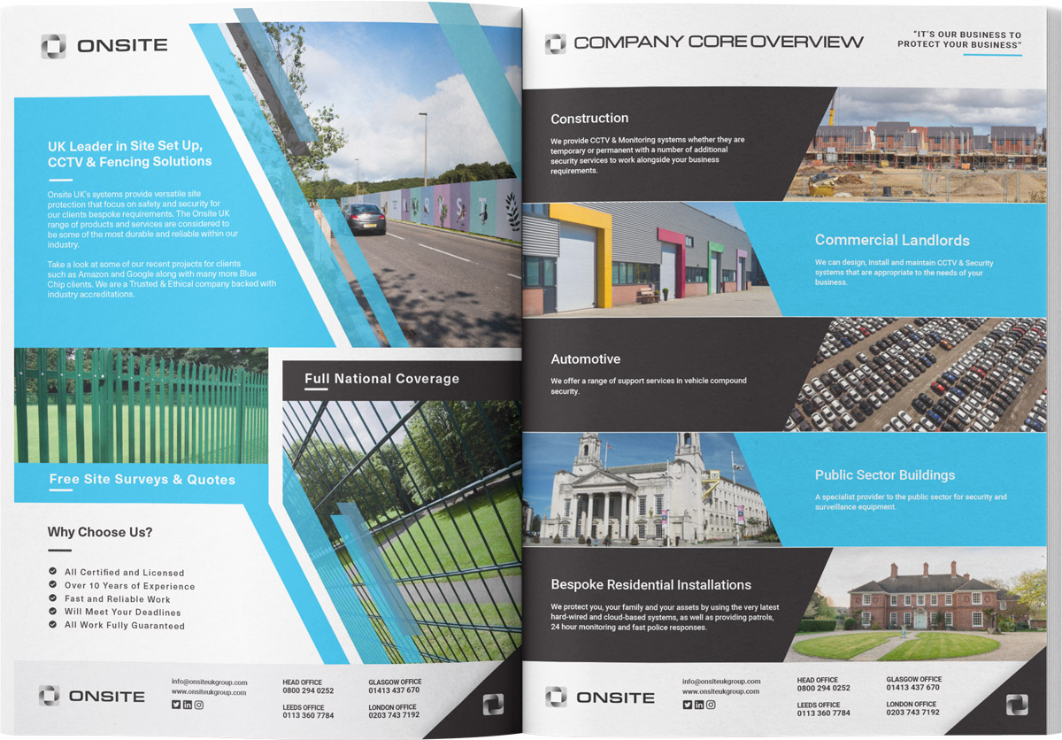
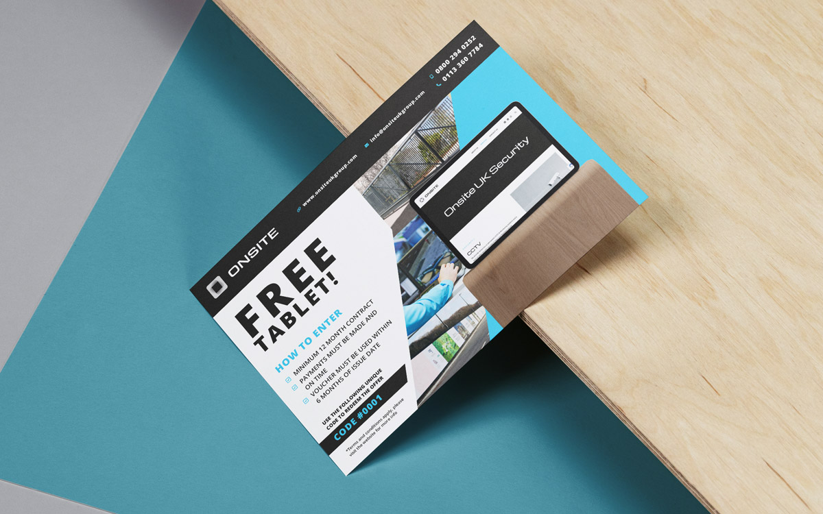
Opting for a simple palette of only 3 colours, these would be used to create bold and striking designs for the printed materials and stationery.


Secure Lounge Area

Onsite Head Office

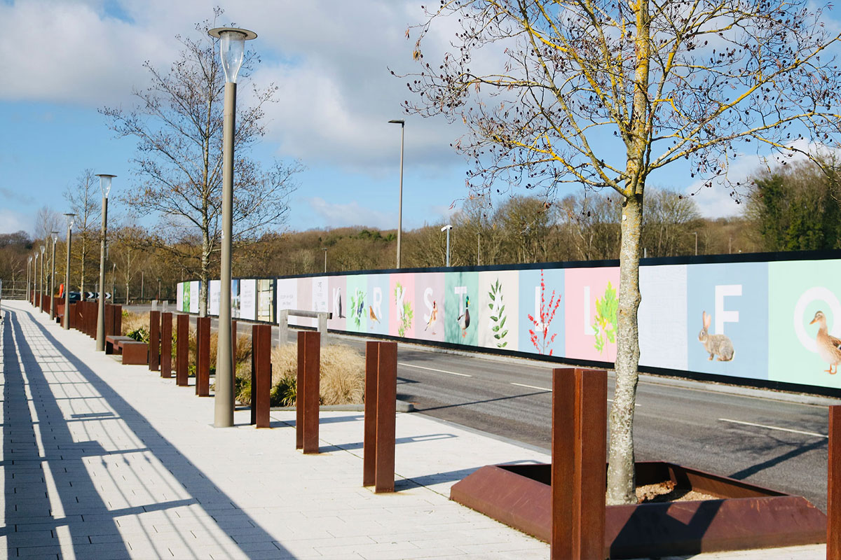
Fencing & Hoarding
Project
Graphic Design
Client
Onsite UK Group
Sector
Security
Year
2020 – 2024
Audience
United Kingdom
Services
- Digital Design
- Graphic Design
- Brand Strategy
- Photography
The Brief
To completely rebrand Onsite UK Group, including the logo and any marketing materials that were currently being used.
The branding needed to be slick and carry a reassuring tone to it to help Onsite UK Group standout in the ever growing and changing security sector.
I was given a specific pallet of colours to work with in order to complete their vision of what the branding should look like.
The Result
The rebrand was a success, the client and as important, their customers were very impressed with the new look.
Finding new confidence in their fresh branding, they approached multiple large corporations looking for new business and suceeded in securing several contracts for many years to come.
BackFresh branding & website
New products, new photographs and a clean website
A local start-up
Branding, website, graphics, the works
