Destiny
Competitions
I was tasked with creating the branding identity and a lottery-style website to host competitions for various goods and cash prizes.
The plan was to keep things simple and straightforward so customers could jump on to the site and feel immediately familiar
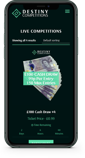
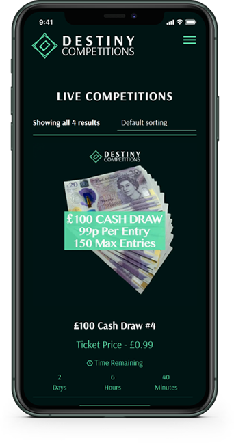
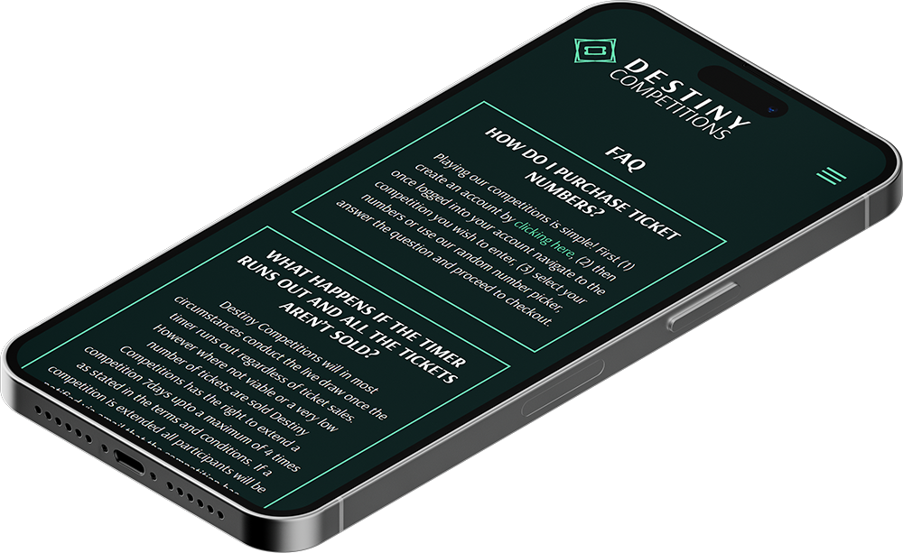
Responsive Design
As with all projects, any web design project created by Kiseki Studio is responsive from the outset.
The goal is to create an easy and intuitive experience for mobile users.
Lottery
Ticket
System
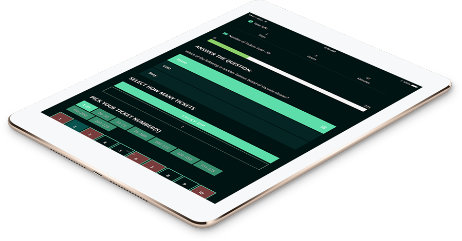
One of the main requirements of the website was to create a lottery ticket system where users were asked a simple question and then allowed to select their desired numbers.
Logo &
Branding
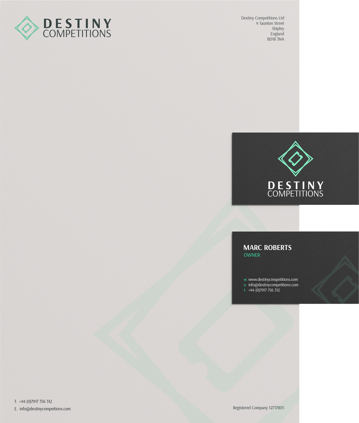
As well as designing and building the website, I was also tasked with creating the branding for Destiny Competitions.
Going with the vibrant mint green colour for the logo and using a bold sans-serif font, it stands out, yet gives the feeling of trust.
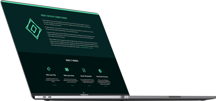
Clean and Simple
Easy to use and quick to navigate, making entering a competition a breeze.
The bold colours and dark shades contrast well to engage the customer whilst not being too intense on the eye.
Project
Startup Business
Client
Destiny Competitions Ltd
Sector
Entertainment
Year
2020
Audience
Global / Online
Services
- Branding
- Digital Design
- Web Design
- Photography
- Development
- Web Hosting
The Brief
The brief was straightforward, giving the site a major update by creating a fresh and interesting design for the company. The previous website had not been changed for over 5 years and it was in desperate need of bringing up to date to help Dedicated VMI stand out amongst the competition.
The site would need to be responsive and display the vast amount of information and data in a way that could be quickly found, read and processed by the customer. There was also a request for occasional updates in the form of a news section and product information updates so a content management system would need to be used to accommodate this.
The Result
For this project I wanted to go big and for it to have a presence on the page. I went for a full-width layout making use of big bold imagery along with snappy paragraphs which got right to the point.
With there being such in-depth information about each of their products we decided to keep things contained and short then let the customer decide how much more information they required by clicking on the relative buttons. This helps keep the focus on the product and what its benefits are first then supporting information can come later once the customer has decided they are interested.
Start Your Project BackFlexible Office Spaces
A new take on office rental and meeting spaces
Fresh branding & website
New products, new photographs and a clean website
