Flex
Workspaces
I was tasked by Flex Workspaces to create their branding and deliver a responsive website for this start up serviced office space provider.
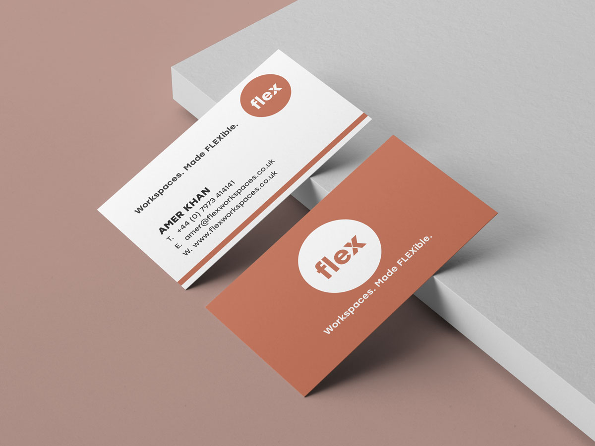
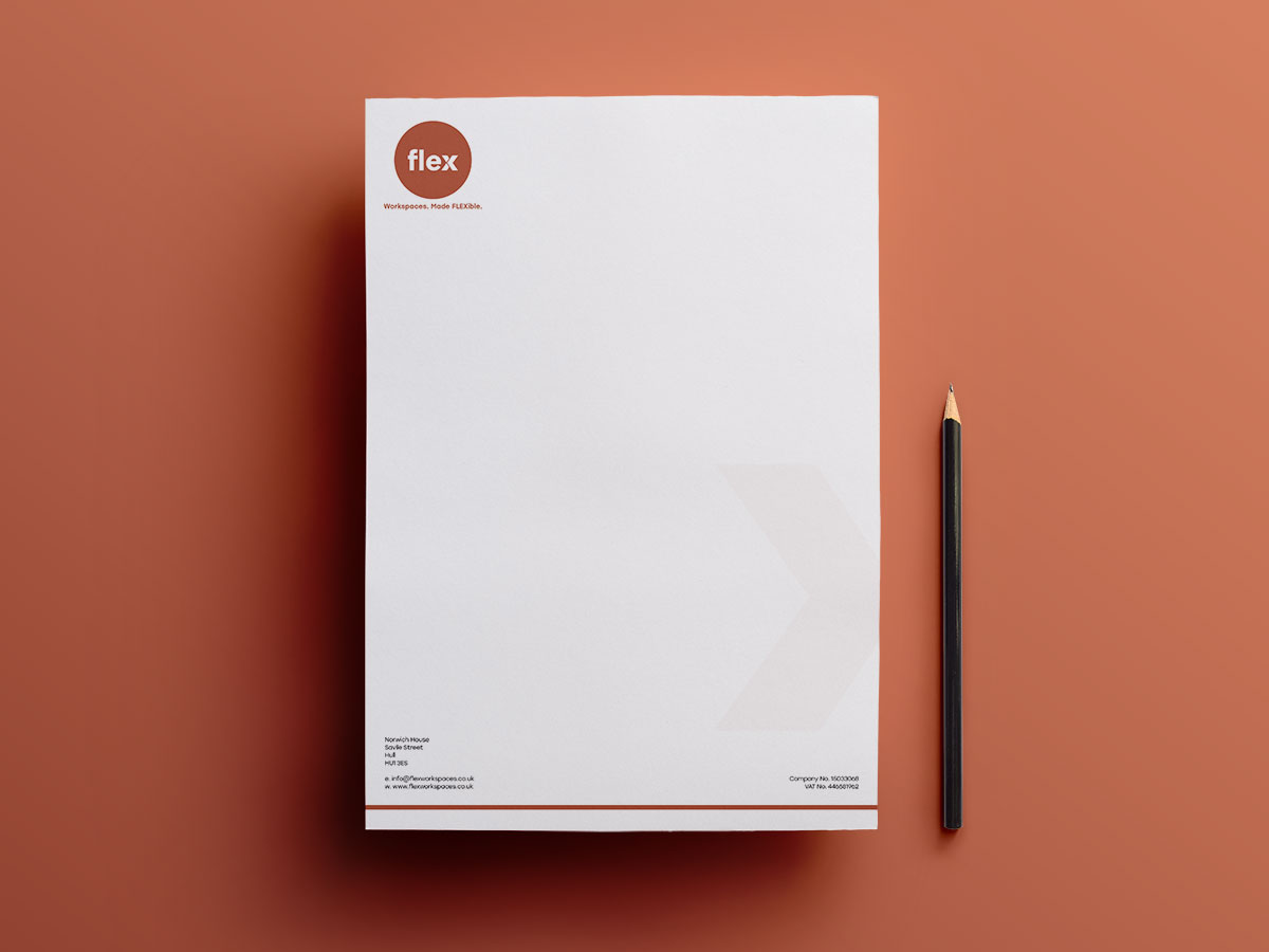
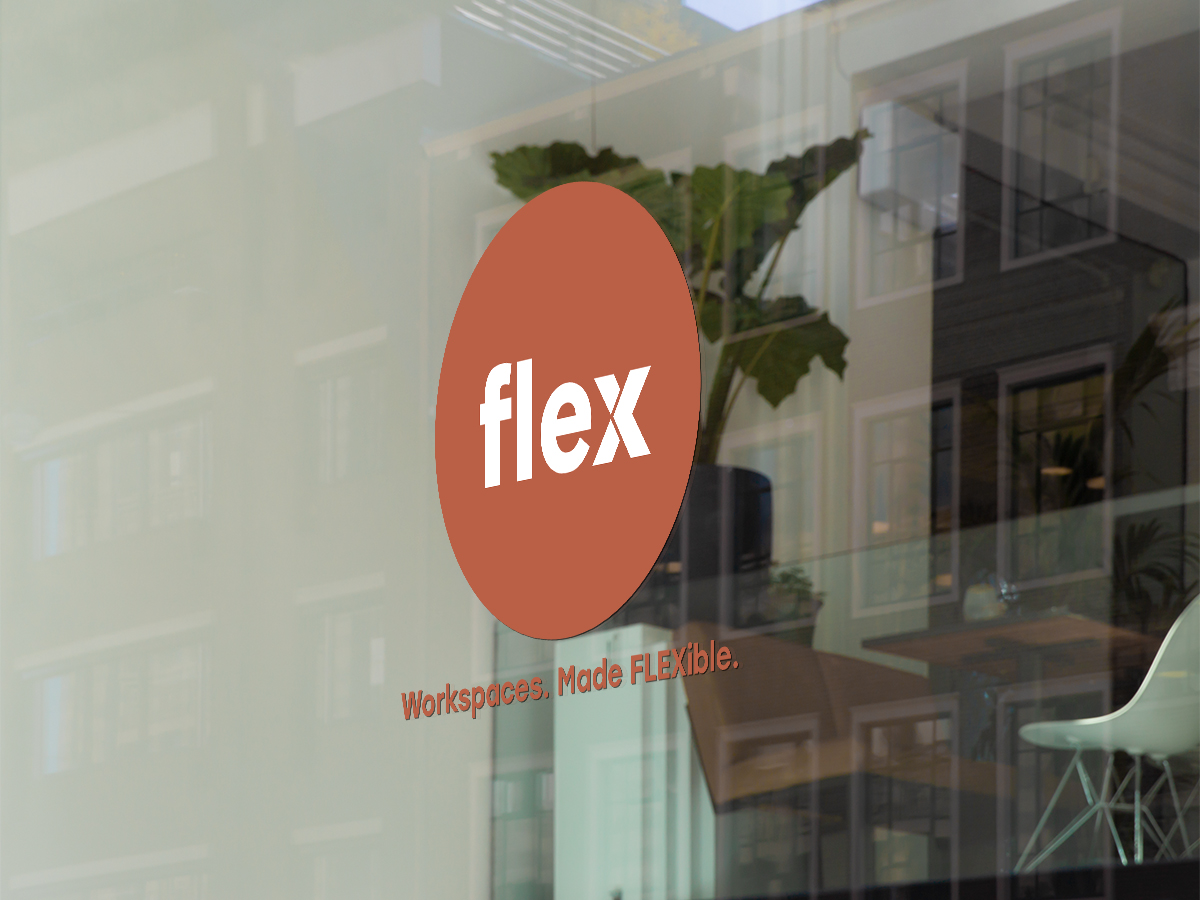
One important aspect of the design brief was to include a single colour to make them standout in this competitive market.
Flex Business Cards
Flex Letterhead
Flex Signage
Responsive Design
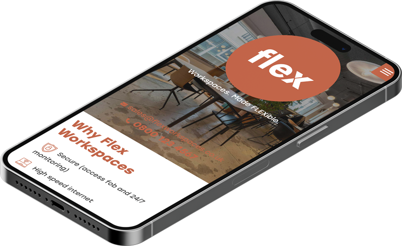
Flex needed a responsive website due to the demanding need of their clients who are constantly on the go.
A mobile first approach was taken to ensure that finding the right office space and the booking process was as intuitive as possible.
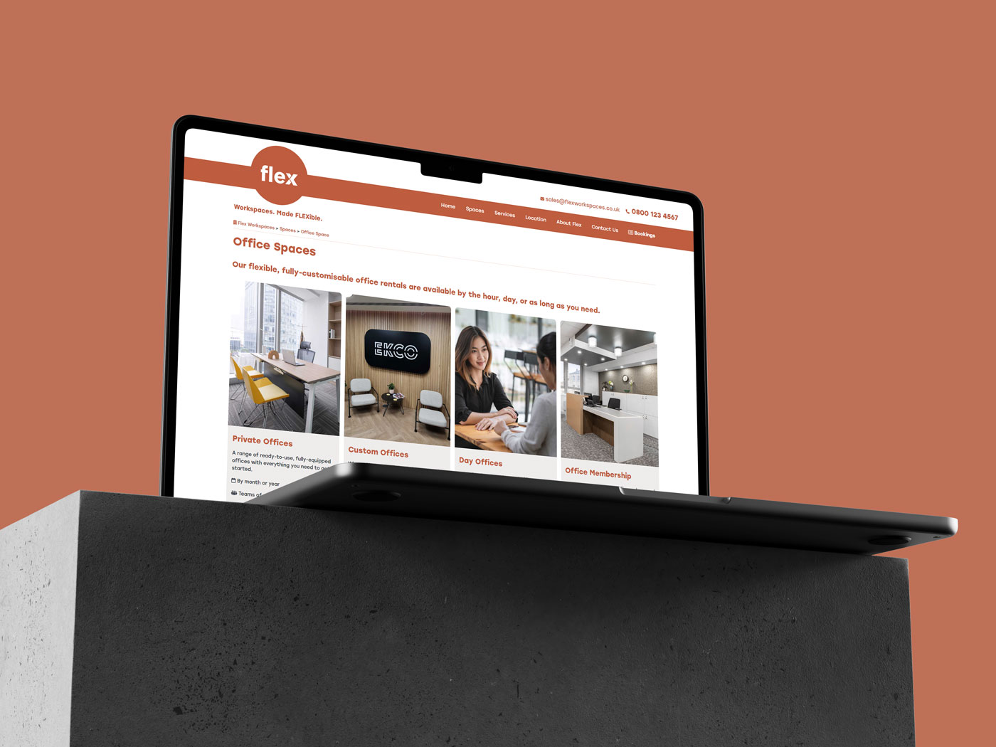
Striking a balance
When designing the site, the client wanted an easy to follow layout and UI. I achieved this by keeping a monotone palette of the orange and white with black text.
Going with a grid style layout it’s easy to distinguish between each product type, then on to the booking area which is clean and simple.
Friendly
& Warm
After researching and being informed that the majority of office rental companies are mostly faceless and cold in terms of their design, I set out to make Flex much more welcoming and put the human element back.
I achieved this with the inclusion of a warm and neutral colour along with implementing imagery of people enjoying the office spaces and amenities on offer.
The main colour is reminiscent of terracotta or burnt sienna, often associated with earthiness, warmth, and cosiness.
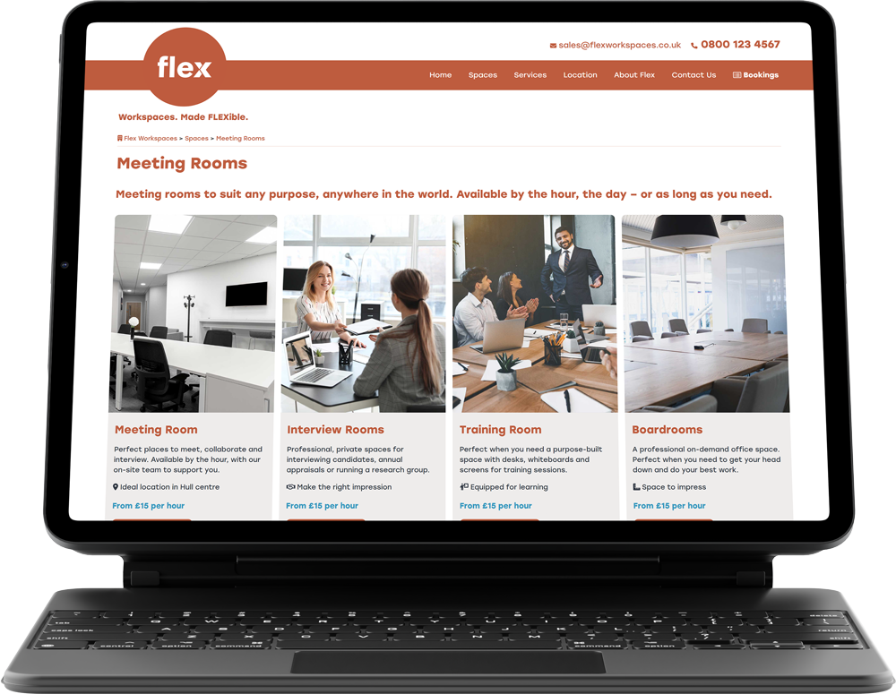
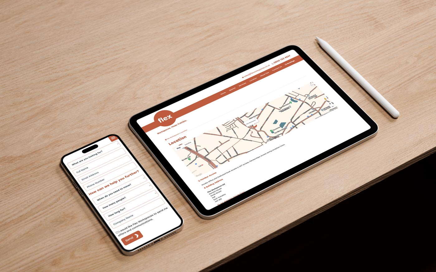
Professional yet Fun
Keeping the warm and friendly vibe was important, but also showing that Flex Workspaces is a fun place to work and be creative was another challenge.
Through the use of a bold yet warm colour, fun shapes and the right imagery I believe it has the balance of professional and fun.
Commercial Photography
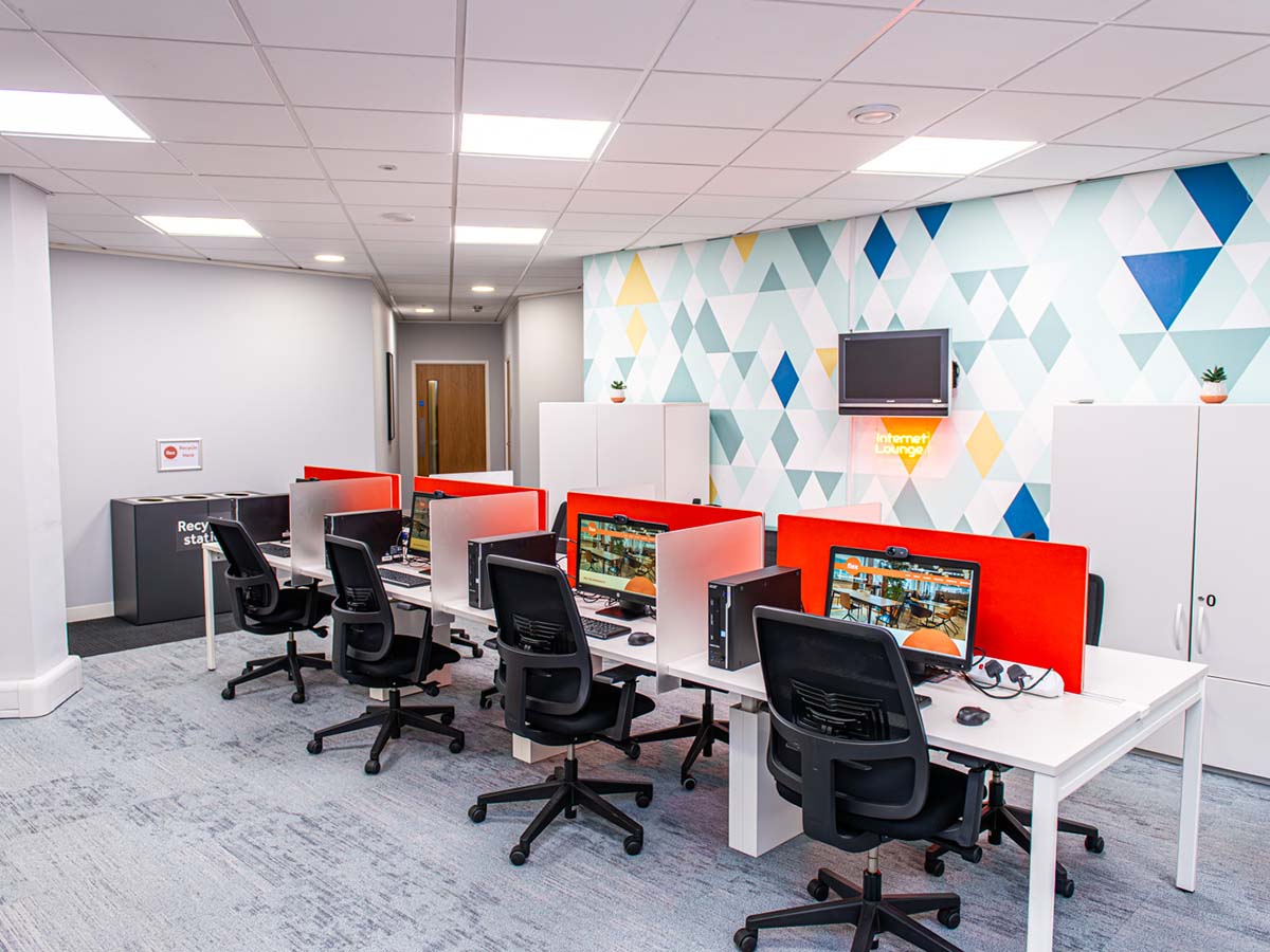
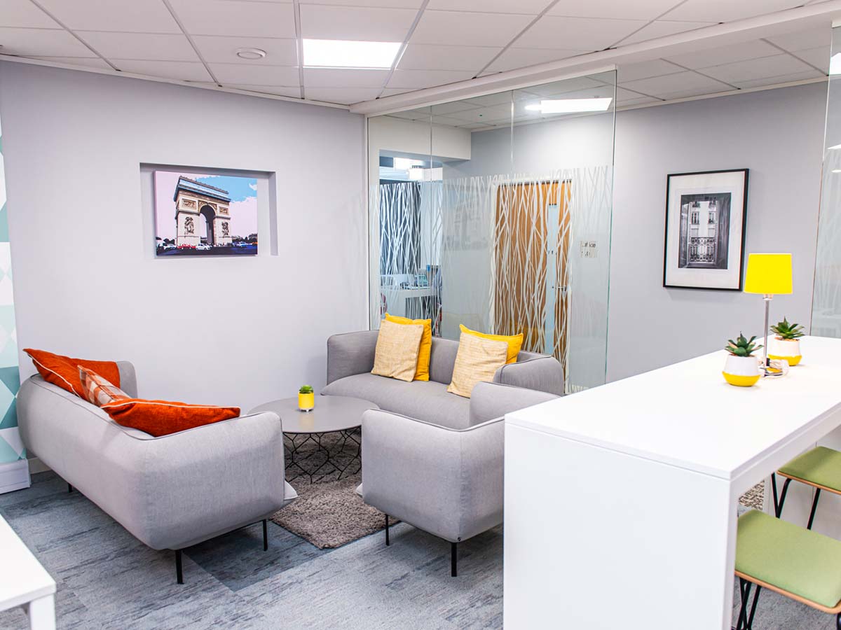
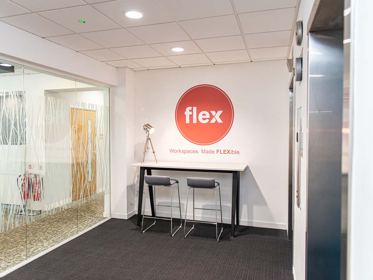
Paired with the new website, a photography session was booked in to capture the newly refurbished offices and the addition of an internet lounge.
The freshly refurbished offices and crisp quality of the photographs were aimed at helping to promote the flexibility of the workspaces and capture the variety that is on offer.
Flex Internet Lounge
Flex Break Area
Flex Reception Area
Project
Startup Business
Client
Flex Workspaces Ltd
Sector
Office Space
Year
2023
Audience
Global / Online
Services
- Branding
- Digital Design
- Web Design
- Graphic Design
- Photography
- Development
- Web Hosting
The Brief
To create a brand that would standout in a competitive market. The main focus on being a bit different, using a bold colour and going against the norm of the faceless enterprise of office workspace hire.
It was mentioned to me by the client that they didn’t want to go down the typical route of a faceless, corporate looking office space website. It needed to be something more fun and approachable with the human feel to draw new younger customers to the office space.
The Result
The website went live in January 2024 and was well received by the public of Hull and the customers who are currently occupying the office spaces. My client noted how well the use of a single colour worked on the website and how it was carried through the building to create a cohesive brand feel throughout.
With the inclusion of photography on this project I was able to match the style of the website and photographs to present each office space at it’s best. The old adage is very true in this case of a picture is worth a thousand words. A big emphasis on large images throughout the site promote each office space without hiding anything from potential customers.
Vist the website BackFresh branding & website
New products, new photographs and a clean website
A local start-up
Branding, website, graphics, the works
